A self-directed project exploring a to-do list that prioritizes intentional constraint rather than feature depth.
Welm organises tasks into three sections: Later, Next, and Now - each with a restricted capacity, forcing users to continuously close out tasks to progress and make trade-offs about what deserves attention.
While personal in origin, it functions as an ongoing exploration of how usability constraints and friction can shape habits, decision-making, and productivity for the better.
Modern task managers make it easy to add tasks indefinitely, defer decisions, and rely on metadata (priorities, tags, dates) to seemingly manage productivity. While this lowers friction to capture, it often increases cognitive load, decision paralysis, and avoidance - especially when everything feels equally important.
The challenge was to design a task system that:
Encourages active prioritisation of tasks/work.
Incentivises task completion instead of task management.
Stayed simple enough to be used daily and flexibly.
While not a commercial project, the app sits within a broader shift toward simpler, more opinionated productivity tools that prioritise behaviour change over configurability.
The opportunity space includes anyone who is overwhelmed by infinite task lists, amidst a growing cultural focus on attention, focus, and cognitive health.
As my first solo app project, this project was also an opportunity to learn about the end-to-end journey of app releases - and what better way to make this happen than with an app that would help me get it done as I worked on it.
Time and resource constraints required a lean, iterative release approach.
As a self-directed project, constraints were primarily around time, scope, and resources. The app was developed alongside full-time work, requiring careful prioritisation of what to build, what to defer, and what to leave intentionally unresolved.
Key project constraints included:
Solo ownership across design, build, QA, and iteration.
Limited engineering experience, influencing tooling and architectural choices
A need to ship progressively rather than design everything upfront
Working within the affordances of Cursor and v0 instead of a bespoke stack.
As a self-directed project, maintaining motivation and momentum.
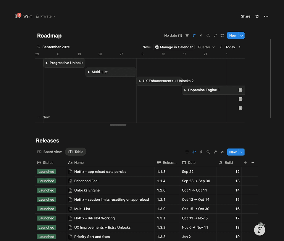
To manage this, I loosely modelled an iterative release plan, prioritising small, coherent feature sets and fixing bugs as they surfaced rather than batching polish late.
While lean and explorative in nature, the project still benefitted heavily from planning and prioritization.
The idea was born out of personal methods in organizing my to-do's, as well as readings into behavioural research and observed patterns - such as Hick's law, Zeigarnik Effect, Parkinsons Law and Goal-gradient effects.
The idea was to encapsulate established ideas into the core patterns of a productivity product:
Limiting active tasks reduce anxiety.
Forcing prioritisation before execution could improve follow-through.
Completion needed to feel rewarding to sustain habits.
Rather than optimising interface clarity alone, the insight was that when a task exists (Later vs Now) matters as much as what the task is.
Early prototypes made using v0 and workarounds in other apps.
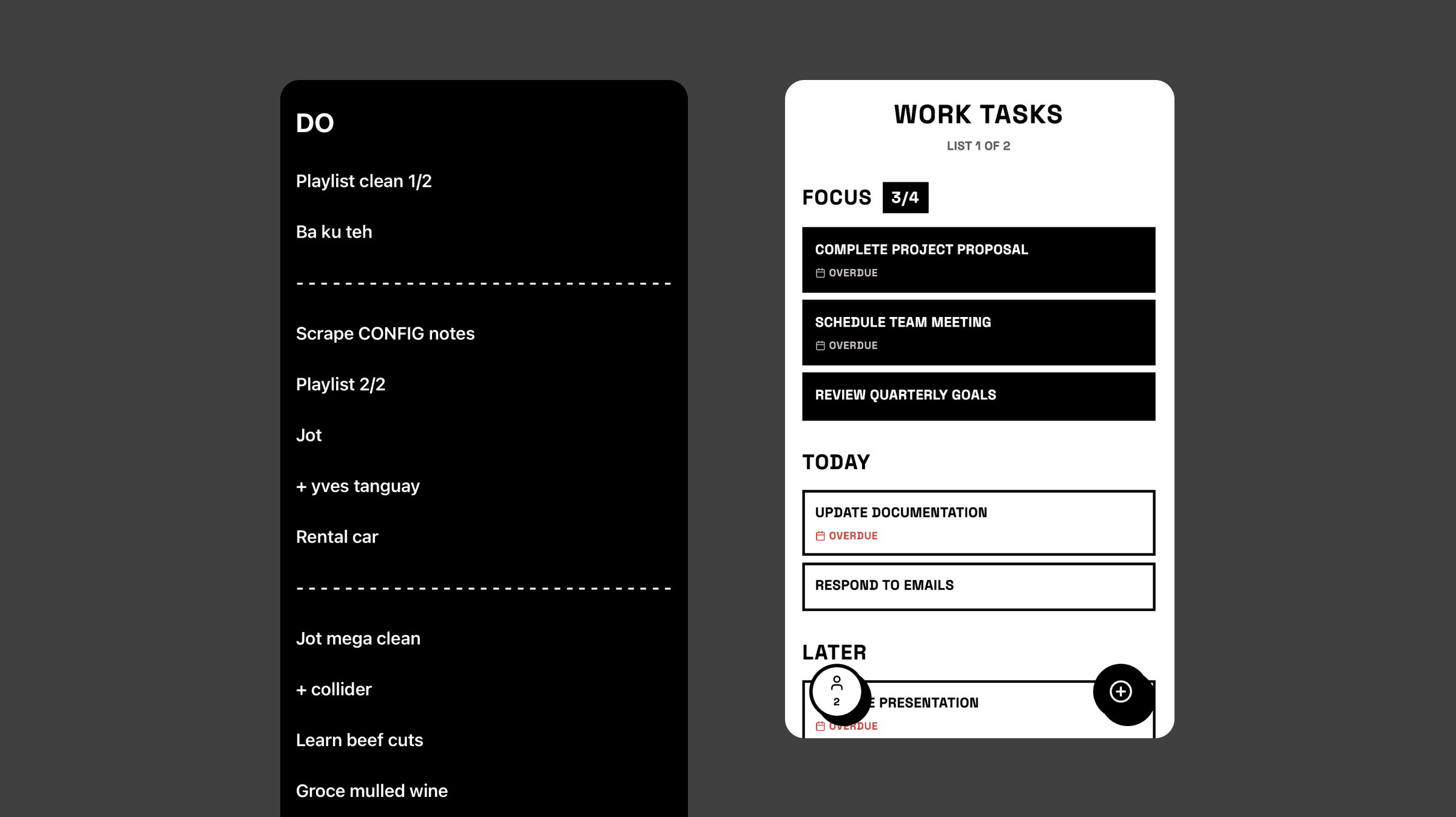
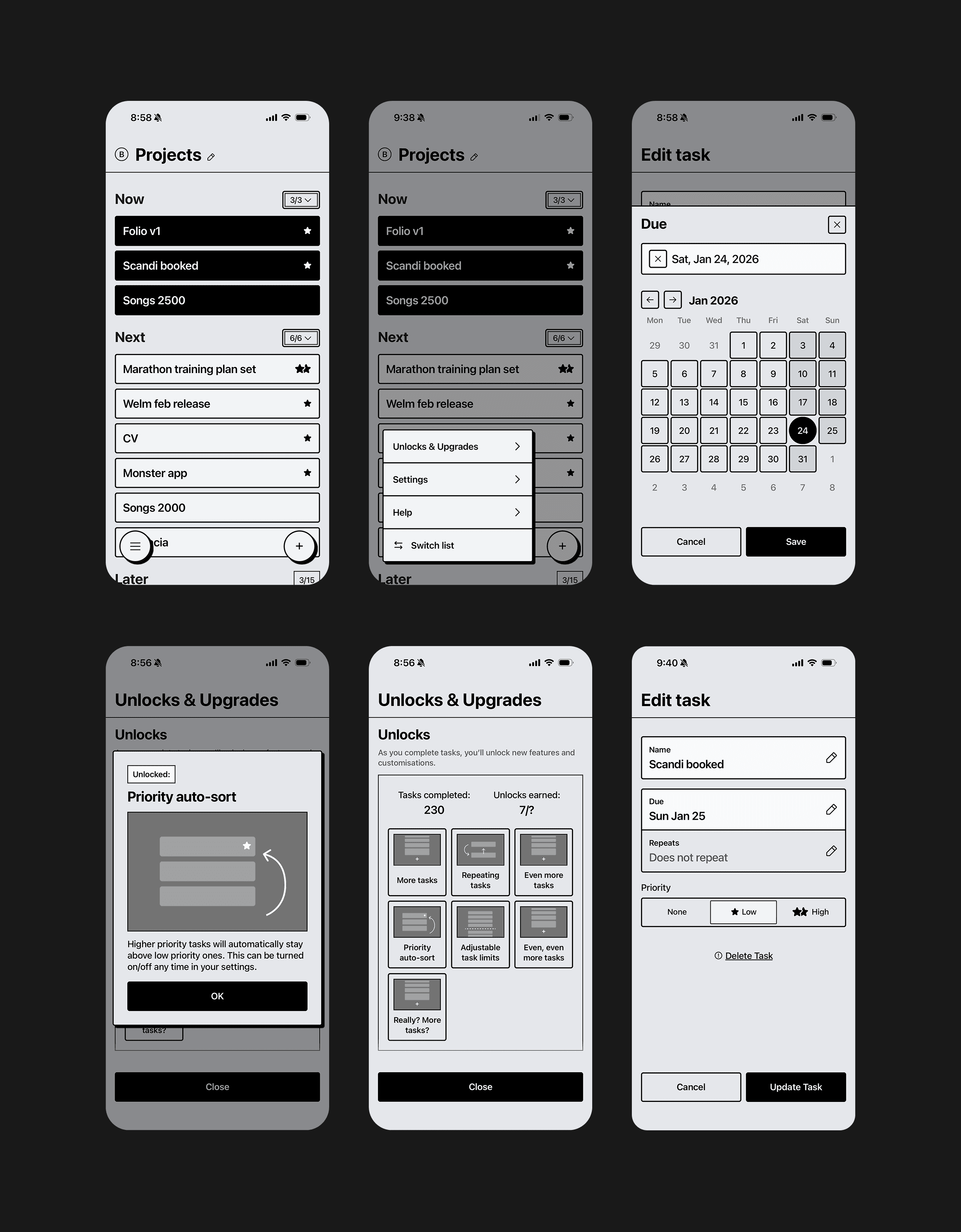
After much iteration and fine-tuning, the final app organises tasks into three temporal buckets:
Now - deliberately small set of tasks that are being focussed on.
Next - committed upcoming work.
Later - all other planned work.
Each section has a fixed capacity. To progress tasks, users must complete tasks to create space, creating a continuous, lightweight prioritisation loop that makes trade-offs explicit and interlinked. Positive action directly leads to progress.
Inaction when it comes to completing tasks directly leads to friction.
A system dubbed the 'dopamine engine' reinforces behaviours and increases the task completion point.
A system of rewards was also introduced to enhance the completion point of the to-do list. Dubbed the 'dopamine engine' it was designed to make completion—not planning—the most rewarding action within the app.
When the user completes a task, one of several things could unexpectedly happen:
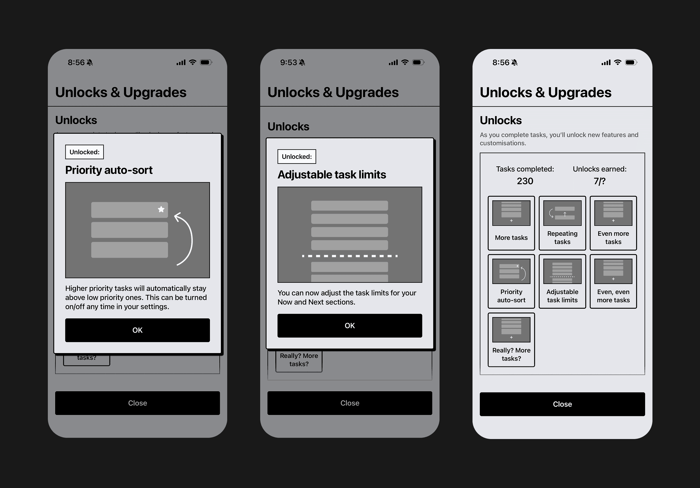
At certain unknown thresholds, a minor customization or change unlocks - such as: greater section limits, Repeating tasks or advanced customisation options.
(Planned for a future release) a cosmetic animation of random type will be played.
Unlocks are paced to be occasionally surprising, reinforcing habit formation without heavy gamification, plus have the added benefit of introducing greater flexibility and controls to users who are becoming increasing familiar with the app and in theory, more disciplined using it.
Modal announcing an unlock has been earned.
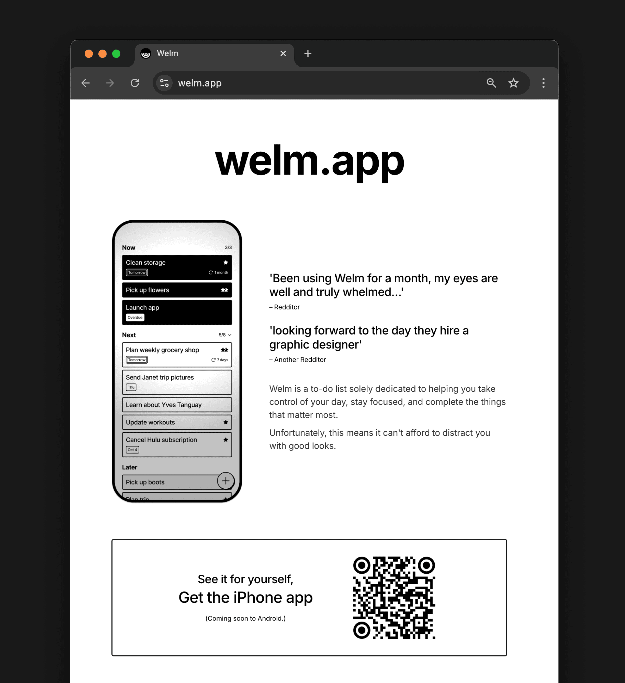
'Cardboard DS' - a functional yet intentionally bland visual design.
Visually, the UI is intentionally restrained in color, flourishes or qualities signature to modern UI sensibilities, using a stark neo-brutalist aesthetic to reduce emotional noise and novelty.
This was done for a number of reasons:
It simplifies the UI and (after repeat viewing) enables the app to provide maximum focus on the key information: the tasks themselves.
It forced me to create a component library from scratch, allowing me to gain more learnings in UI refinement and DS planning.
It also distinguishes the app from others in an increasingly homogenous UI landscape.
Welm's website.
While not publicly launched at scale, personal usage and testing showed:
Smaller task lists over time
Faster decisions about what to work on
Stronger bias toward completion
Increased awareness of over-commitment
Feedback from a small group of testers (friends and family) helped validate usability, pacing of unlocks, and clarity of the mental model before broader release.
The project remains ongoing, with learnings feeding into future iterations.
This project reinforced that there are opportunities for more opinionated apps and experiences, especially in an age of accelerating development and increasingly homogenous experiences and patterns.
It also highlighted the value of progressive delivery in self-directed work - shipping early, learning quickly, and allowing the product to evolve rather than attempting to design a complete system upfront.
Finally, building the app myself using Cursor and v0 underscored how modern tooling enables designers to test behavioural hypotheses directly, shortening the gap between intent, implementation, and learning.

